Allegret by
Phase
Details
Submitted by: CONS
- Page loaded: 1285
- Rating: 8.91 (11 Votes)
Votes
Comments
diver4d | 2010-03-20
wicked
Frogg | 2010-09-02
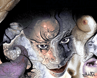
great work on the texture
Anarkhya | 2010-09-03
Too bad that this breast catches all the attention and hinders the reading IMO.
Frogg | 2010-09-04
Perhaps you have a little bit perverse spirit 
Personally i think that the weight of colors and picture is quite well distributed

Personally i think that the weight of colors and picture is quite well distributed
Anarkhya | 2010-09-04
No, honestly, I'm reading (and I guess you too) from left to right, and on the right there is a breast displayed using high contrast (white on black).
This creates a focus point...
This creates a focus point...

