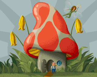
Shroom With A View by
Grip
Description
#1 at BFP 2013 Amiga Compo. Details
Submitted by: Grip
- Page loaded: 1408
- Rating: 8.5 (4 Votes)
Tags
Votes
Comments
Grip | 2014-04-15
Thanks!
I'd be much happier if you pointed out _what_ sucks about the anatomy and not just _that_ it sucks
I'd be much happier if you pointed out _what_ sucks about the anatomy and not just _that_ it sucks

- jok - | 2014-04-15
Ok i will try 
- she looks flat, more like sticker on glass than part of scene.
there is no perspective nor depth (from light)
legs look strange, like made from clay - giving no impression about 3d
I know whole picture is in comic/tale style, but she flies ! And you are suggesting depth for example in mushroom (this yellow part is too bright imo) and open door
I think if you imagine her in space (perspective) and add light like on flowers (very good btw) it help.
But i like this picture, and that comic style. Respect for Dpaint
sorry for poor english.

- she looks flat, more like sticker on glass than part of scene.
there is no perspective nor depth (from light)
legs look strange, like made from clay - giving no impression about 3d
I know whole picture is in comic/tale style, but she flies ! And you are suggesting depth for example in mushroom (this yellow part is too bright imo) and open door
I think if you imagine her in space (perspective) and add light like on flowers (very good btw) it help.
But i like this picture, and that comic style. Respect for Dpaint

sorry for poor english.
Grip | 2014-04-15
Much more valuable input  Thanks!
 Thanks!

(only fearie anatomy sucks little)