Description
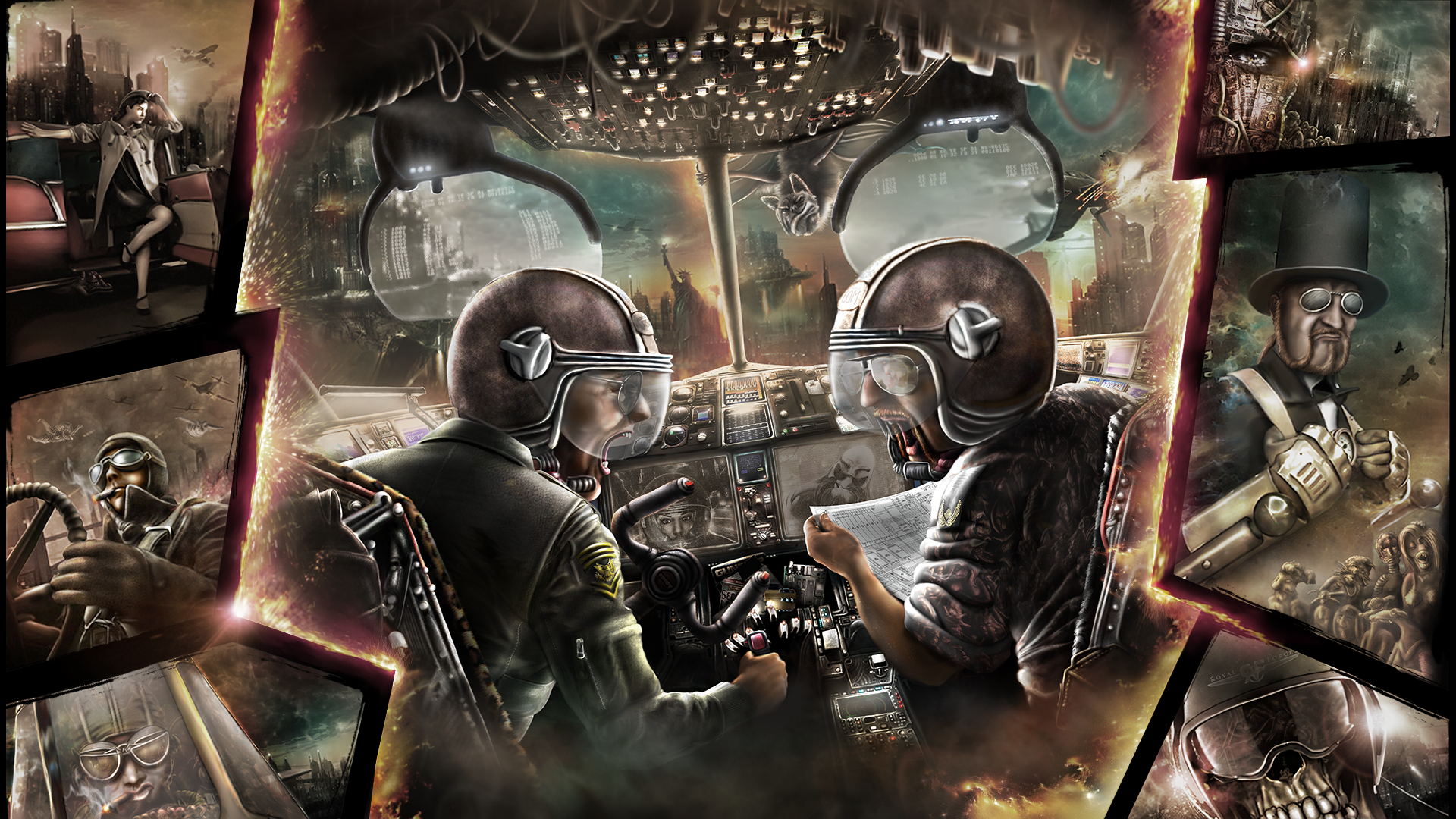
#1 at Revision 2013 modern tools gfx compo.Details
Submitted by: CONS
- Page loaded: 1960
- Rating: 8.5 (10 Votes)
Votes
Comments
CONS | 2013-04-01
This is one of the most detailed picture I have seen for a long time, afair. Your styles, which are very different on their own, work together brutally good. This deserves to be the winner. Congratulations! Now I will take an hour to check out all the massive details, if that is enough.
prowler | 2013-04-04
Not a fav of mine - but then steampunk never was. However it's a great showoff of details covering the entire screen (an error I have done many times), but the composition lacks a harmony and balance... imho. Still, awesome technique! Reminds me a bit of Luis Royo.

