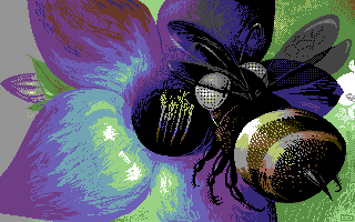
Drink by
Lycan
Description
#3 at Revision 2013 oldschool gfx compo. Details
Submitted by: CONS
- Page loaded: 1874
- Rating: 7.89 (9 Votes)
Comments
Grip | 2013-04-01
Lycan, you are doing basically everything right - you have a personal style, original motifs, great colours and lighting... But your dithering looks so mechanic. If you worked some more on dithering and antialiasing you'd be killing in all the compos for sure.
Lycan | 2013-04-02
yeah, you are right, but i have no idea how to do it fine u_u
veto | 2013-04-02
i like this pic. and imo this dithering became part of your style  you should not really change that, maybe experimenting...
 you should not really change that, maybe experimenting...
CONS | 2013-04-02
I agree with veto here, this is part of how you do graphics at the moment. Let it naturally develop. Experiment but don't force things. I think its a high goal to archive your own style and you are, with regard to your pixelwork, on the best way to do so.
Grip | 2013-04-03
I agree it should be fun first and foremost. Don't force anything. I was just going for some friendly advice 

Lycan | 2013-04-04
I'll try to test and keep the best good-looking way :3
offwhite | 2013-04-24
I also used to think your dithering was too mechanical and sometimes even unnecessary. But it's been evolving, and now I tend to agree with veto and cons. It's become a nice style 
If you're interested in learning other techniques this site has a good introduction: http://www.pixeljoint.com/forum/forum_posts.asp?TID=11299. The sections about what not to do has been really helpfull to me.

If you're interested in learning other techniques this site has a good introduction: http://www.pixeljoint.com/forum/forum_posts.asp?TID=11299. The sections about what not to do has been really helpfull to me.

