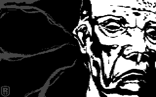
Fear by
Ragnarok
Description
#10 at Nordlicht 2012 mixed gfx compo. Details
Submitted by: CONS
- Page loaded: 1749
- Rating: 8 (2 Votes)
Tags
Comments


It somehow reminds me on SinCity, and the style there - which is a good thing. I played a bit with the palette - or actually just with one colour - the one of the lines in the left. Setting it to the red you already have in the end of your palette, somehow makes it even better - but also more cliche.
So, uhm, very well done - hope I become as good as you one day