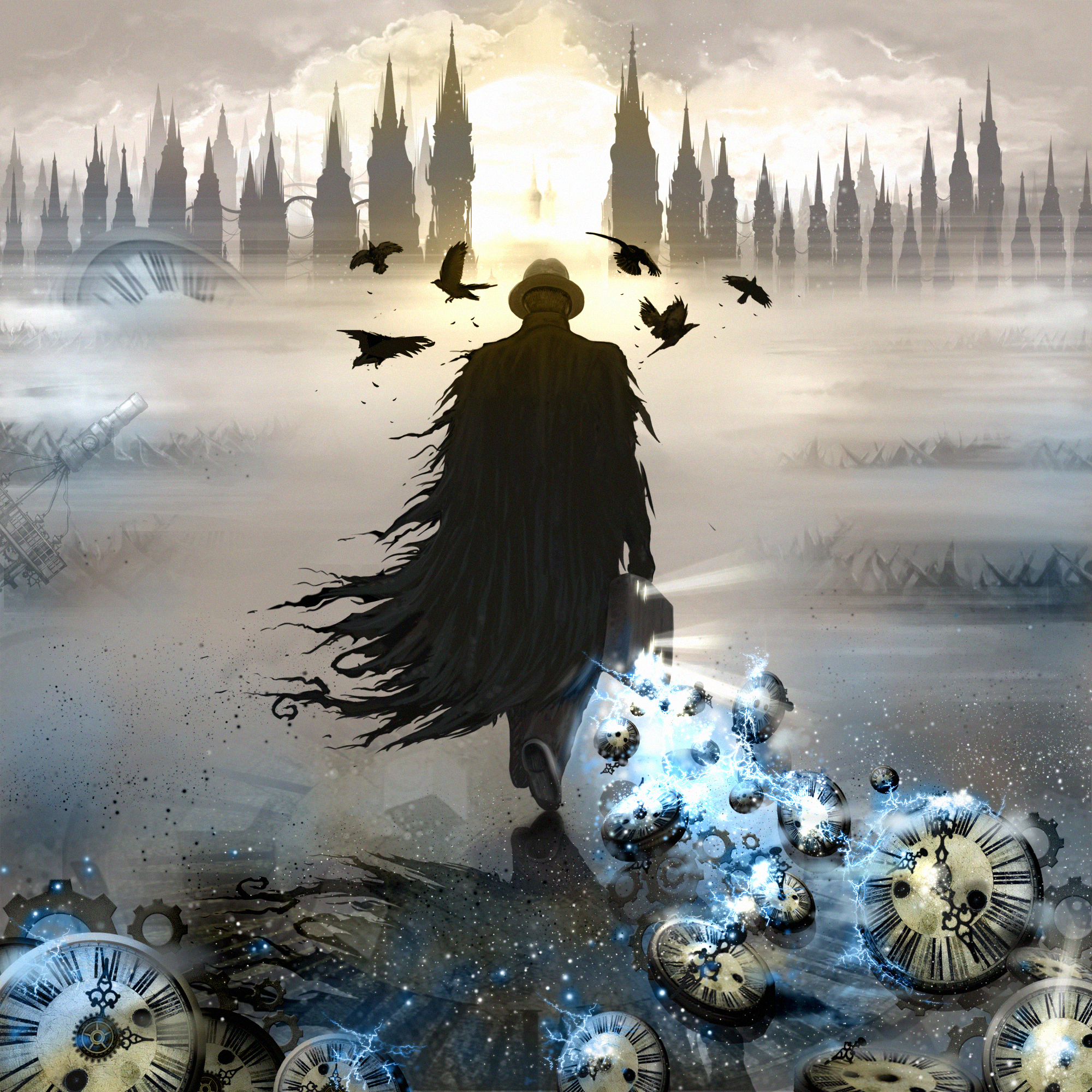
Trapped in Time by
Slayer
Description
#03 at Revision 2012 Modern graphics competition.Details
Submitted by: veto
- Page loaded: 1831
- Rating: 8.33 (15 Votes)
Votes
Comments


Crits: for me the composition is a little distracting to look at because there are a lot of right angles (horizon, skyline) and 45 degree angles (objects on the ground), which - in my mind at least - creates a 'grid' across the image (this is also helped along by the main focus of the picture being centred, and the clouds/glow in the top middle (between the buildings) having an almost 'mirrored' look.
But ... at the end of the day it's a subjective thing, of course