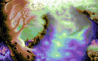
Dude, i got myself a logo! by
Tomic
Description
or the Pixel Joint weekly challenge. well, obviously. decided to go 8 colors again.. and 427 pixel wide, somehow got comfortable with this width recently ;Daccidentaly found out that it looks quite nice rotated by 90 degrees.. so, if you're planning a game or some kind of demoscene release titled "yotipp" and are in need for an upright logo, contact me ;D
anticipating ppl bitching about the legibility of the "i":
[weisenheimer mode on]
it's been scientifically proven, that vowels are not necessary for the human brain in identifying a word.. so, semitic alphabets for example, most notably the arabic and hebrew (yes, they've got things in common!) omit vowels.. instead of vowels, there are several 'dots' to underline the pronunciation / disambiguate things.
[weisenheimer mode off]
.. and there are clearly enough dots around that letter indicating that it is an "i". lawyered ;D
wip:
sketch http://www.piexeln.de/_wip/tomic-pjtomiclogosketch.jpg
working stages http://www.piexeln.de/pics/tomic-myself_a_logo_wip.gif
Details
Submitted by: gr4ss
- Page loaded: 1605
- Rating: 8.86 (7 Votes)
Comments
elend | 2010-05-21
Oh yes. This is something I really like.

