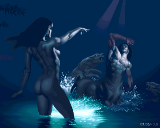
Artemis by
Eloy
Details
Submitted by: CONS
- Page loaded: 4496
- Rating: 7.8 (5 Votes)
Tags
Comments
Wade | 2011-04-20
So much nicer than the original in my opinion. I love the lighting, the colours for the skin and how the water looks translucent.
chromag | 2011-04-20
Dunno what to think of those repaints...
someone | 2011-04-21
Wade: well, the original in this page is a small and smudgy jpeg. I bet the original painting would convert you.
chromag: that's like saying dunno what to think of demoscene graphics. The golden rule is that if it looks good, it's a repaint. you can count demoscene's gifted illustrators/painters with one hand. well... maybe two, but no more
chromag: that's like saying dunno what to think of demoscene graphics. The golden rule is that if it looks good, it's a repaint. you can count demoscene's gifted illustrators/painters with one hand. well... maybe two, but no more

Anarkhya | 2011-04-22
original (better? version) reported, this one was really crappy but the newer is... different, not bluish, apparently.
Wade | 2011-04-22
Tempest: You're probably right. I'd really like to see a better quality of the original.
Frogg | 2011-04-23
well it seems the original picture use different color.
(ed.CONS:link added, thanks!)
(ed.CONS:link added, thanks!)
Anarkhya | 2011-04-24
AFAICS on search engines, there are multiple scanned results for "The Punishment" by Vallejo , some are bluish, some greenish, some polychromatic. This is odd. Anyway, official Vallejo site might give this result some kind of authority :
http://www.imaginistix.com/art/comps-i11.cfm?number=B-301&key=36063014.5
http://www.imaginistix.com/art/comps-i11.cfm?number=B-301&key=36063014.5


