03 Hugi #34 - Behind the Graphics
Hugi #34 - Behind the Graphics Written by Tascha and Magic
Prologue
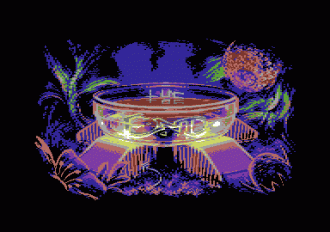
The main menu layout for Hugi issue 34 was, just like in Hugi issue 33, drawn by Bridgeclaw (Henning). However, in Hugi issue 33 the main menu layout was hand-crafted by Bridgeclaw from the title picture. This time it's different. The title and ending pictures of Hugi#34 were painted by Bridgeclaw's girlfriend Tascha. It was Tascha who Bridgeclaw painted in the titlepicture and layout in Hugi issue 33, which Bridgeclaw also explained in the 'Behind the graphics' article from that issue. (Press ctrl-2 to get this layout again.) Now we want to give you some information about Tascha. In our humble opinion she is at least at the same level as Bridgeclaw in creating graphics. On top of this you will see a step by step explanation from the Hugi issue 34 title picture called 'Can't stand the light'. Enjoy!
Magic:
Hi Tascha, welcome on the demoscene
 Could you please introduce yourself to our readers?
 Tascha:
Well I am a soon to be 33-year-old Swiss artist currently living in Greece with Henning Ludvigsen and working on Darkfall Online. I used to work as Freelance Illustrator and still do every now and then but recent health issues are making this option a bit complicated right now. I grew up as a single child of two photographers. That meant of course that I had a lot of free time to spend on my own which mostly got used for painting and drawing. Until the day I started higher education in Switzerland and pursued more of my sportive side I kept on drawing but with all the different interests I had I stopped painting for a long time. It was not until I discovered Online Gaming and MMORPGs and started sketching other people's characters that I really got back into it. I also picked up a really old Aiptek Tablet at one of my old working places which was the start to me going digital. Until today I have worked for several clients both for the book and gaming industry. I was also lucky enough to have my work published in a lot of books and magazines.
Magic:
Please describe how you became involved with making graphics on computers and tell us in a somewhat chronologic order how you evolved to the graphics artist you are today.
Tascha:
I was always interested in both Computers and Art. A few years back I worked as WebDesigner (both Coding and Design) for a little company in Switzerland. It was there where they had an old Aiptek tablet lying around which sparked my interest. I convinced my boss to plug it on my computer so I could try it out. Honestly though, my first tries with a tablet were very clumsy and awkward. I couldn't really get used to the fact of looking at the screen while drawing normally on the table. Hand eye coordination is one of the hardest things to get used to for someone starting out with a tablet. After this I googled hours for tutorials on how to use tablets. I already had Photoshop installed for my work so it was just natural that I initially started to work with that program. I started to buy books about anatomy and manga art (duh..). Started an online gallery at Elfwood (where you can still see some of my older works if I am not mistaken) and joined other communities where I got to meet a lot of amazing artists, to some I still have contact nowadays. From there I came to the websites I still frequent every know and then but nowadays I prefer on laying low rather then having a lot of fuss around my persona, so I am not posting that much at the moment. The sites in questions however were gfxartist and cgtalk. Both of them gave me a lot of recognition and people almost overwhelmed me with positive feedback which I never expected in such an extend. After winning my first CGTalk Choice Award I just got swamped with requests and questions, that is where all really started I guess. I still think I rather slipped into the whole business than really planning 'to become an artist'. It just somehow happened and I guess I was very lucky to be at the right spot at the right time.
Magic:
What is your knowledge about the demoscene and Bridgeclaw's (Henning's) past on it?
Tascha:
Oh god, you had to ask that right? Ah well, I have to admit I really don't know much. I have seen some very old pictures of him and friends going to Parties. I also know that he used to be (still is - don't know
 ) quite a name in the Scene. He did show me some of his earliest creations and I was extremely impressed as to what was possible with pixels (and enough patience I guess). Lately I have seen some of the movies you guys made (and others), they look impressive but I once again have to admit I really can't judge anything what I see because I simply am not that well informed about the scene (even though Henning tries hard to explain it to me every now and then. I just seem to be a lost case in that part!). I do seem to remember though that he mentioned some pretty weird videos being shown between showings of actual demoscene movies (laughs). Other than that, I think I would have felt right at home in those rooms filled with geeks
Magic:
Bridgeclaw's artwork with your image was used for Hugi#33. Have you seen Hugi#33? What's your opinion of it reading a digital magazine with yourself in the layout?
Tascha:
Yes of course I have seen it! I totally love the format with being interactive. It's a lot of fun to use the buttons and such to flip through things. Much easier to navigate and read than normal websites or online magazines. In regards to your question about me being part of the image. Strangely enough I have gotten used to it. I have to admit that I felt a bit weird at the beginning. Especially when some of the early works with me as model got published. However, the image is hardly ever 1:1 so I am not really 'seeing it' as being me. Kinda strange isn't it? I wouldn't really want full nude stuff of myself on the net though. Doesn't matter if that would be pictures or paintings.
Magic:
The entire Hugi staff would like to thank you very much for your great title and end pictures! What would you like to tell the readers of Hugi#34?
Tascha:
Well, I promise to bug Henning to tell me again what the Demoscene is all about
And I am very honored and would like to thank you for the opportunity to be featured in Hugi. Other than that, it's not always about talent, if you want to follow some of your dreams persistence is much more important than talent Can't stand the light Process
I started with a rough sketch of the general idea. I keep helplines on a seperate layer (like the cross over faces to get the angle right or shoulder/hand circles). I'm used to reminding myself that it is in fact form beneath, not only lines. During the process I noticed that I positioned her pretty badly and you will notice that I moved her more to the right.
I cleaned up the sketch and deleted the helping layer with all my supporting sketch lines.
With my favorite brush I started blocking in colors. To start I don't really take care of not using too dark shades as I will lighten and color them on the process regarding what kind of ambient light I have. I decided on a main skin color and then laid very rough shades of darker and lighter parts on top of it with a big brush.
With a brush I created for backgrounds I start to create layers of depth so I can see where on the painting she will be placed and what parts are in front of her and which behind her.
This is a stage where I just add strokes without thinking much.. especially the wings where during this time I had no clue what I wanted them to look like. The only thing I knew was that they weren't supposed to be white.
Instead of making the same mistakes I used to do a while ago I now work on the whole painting to keep about the same level of detail throughout the process. I used to only focus on the face before even looking at any other parts.
It was extremely important to me to keep a consistent color scheme. Keeping the main light source in mind I started to "ground" her. I also wasn't quite sure what to do with her headpiece and an initial idea was to give her a little hat for example.
With a speckled brush I start to blend some of the colors I laid out to create a good base to add more colors later. I tend to start with dull colors and add more hues while I work on them. I find it easier to not pick the wrong colors but to create new layers and add them on top.
I think it was Linda Bergkvist who also states the she does "layer" colors, which is quite a fitting expression.
I decided that her hat was not fitting and made her look like a female Robin Hood.
I am using the speckled brush more to blend in colors and create the actual shapes on her body. At this point I am well aware the the shadow/black parts are way too dark for the ambient light but I use it mainly to block in some shapes at this point.
I decided that even though I was thinking of her as a little demon at first the black eyes are somewhat overused. Besides, I mostly paint eyes like this: Paint the darkest color I am going to use for the eyes and then add the white on top left and right depending where the iris is.
This gave me also a better control of her eyes and the overall facial expression. More smoothing on her skin and face as well as work on the dreaded hands..
I used a feather brush I found on the net to see if I would get away with some feathers swirling around.. or some feathers of her own wings getting dissolved or detached.
During the process of coloring this I make sure to give her an all roundish appearance. I was thinking of those baroque angels in the back of my head and wanted to give her just a tiiiiny hint of that. Besides, I really didn't want to paint a generic looking female model body.
I also played around with some textures brushes - just placing them more or less randomly on the canvas to see what kind of effect it would create.
Uups, forgot to mention: I also was not happy with the wings. I wanted to create my own wings rather then just paint generic looking ones. So I started to just try out different things.
More experimenting on her costume and general look. I now started to brighten up the shadows and give them hues (mostly visible on her hat and the left wing). I figured her skin would reflect a bit on the wing behind but later on I realized that it would be too shadowy there to actually create cast off light.
Lots of random try outs on this (looks very messy and crappy..). Some more textured brushes used to try them out in the background but I wasn't happy with any of them.
At this point I started to introduce more colors and decided to not use too much additional details on her chest because I really liked how the muscle definition was coming along. An initial thought was to create a little gate left of her but it seemed to create more of an outcast feeling to the painting which I didn't really want.
I decided on the final look of her headpiece and detailed all over her body, the same time adding textures by hand to not have it look too flat or artificial. On top I felt I had now a good base and shape going on for her body.
At this point I decided on a total color change.
I was extremely unhappy with the clouds on the back and just couldn't imagine them in those kind purplish colors.
I started to rough in yellowish/brownish/redish clouds and adjusted the overall colors - mostly enhancing the lines between higlights and shadows with saturated ambient colors. I flattened a copy and cut and pasted some of the parts to be able to use the color correction tool in Photoshop (pretty easily visible on her right arm [from our view]) where you can still see some left over of the blueish old color scheme due to the cut and paste.
Finally I felt like the painting started to fall in place and I was now at a point where I could start picking colors from all over and adjust them to my likings.
Much happier with the color scheme I started to brighten up some of the shadows. Due to the fact that the ambient in general is quite bright the shadows would get illuminated (that always creates a very nice effect). I also started to work on the shadows in general. Thinking about where a shadow would get more blurry and where it would be more crisp. (The further apart from an object a cast shadow is the more blurry it gets).
The clouds took me ages..I tried to always keep in mind that the light is coming from the left even though the light source on her had to be stronger I needed to include the same ambient light situation on the clouds as well.
Until now I really REALLY dreaded the work on her wings. I painted them over about 100 times not really knowing what I wanted to do with them or what kind of colors they should have.
I then decided to reuse some of the colors from the clouds to bring the painting together as whole a bit more. Also as you can see I worked hard on brightening and coloring up the shadows now. Thinking over where parts would be more saturated and how the cast shadow from her on her right wing would be.
A custom textured brush worked as a base for some of the "floor"/bottom part.
While talking to Matt during the process I realized that it needed more different values to focus on the main character. So after some suggestions I darkened some parts of the background and enhanced some on her. Ever since I started painting I use a saturation layer filled with black on top of any layer and enable or disable it to check on the values.
The previous version had too many similar values on both the background and on her body which is not a good thing in general. So I made the contrast between her and the background/foreground a bit more visible.
More extremely tidious work on her wings and some more detailing on clouds.
I like using the eraser tool a lot on clouds to create nice puffy looking outlines. Set to really low flow you can use different pressure to create nice depth too.
I am also more happy about the shadows now. They don't look too much like back holes anymore.
The following steps are mostly detailing and correction work. I added some slight cast shadows where the end of the feathers hit the clouds for example. Still brightening and coloring the shadow parts too.
After a painting clicks for me I can just pretty much pick colors from the existing ones and mix them together with color and light to create the right hues I am looking for.
Some more cleaning up, some more light work on the feathers on her right wing. Aaaaaaaaaand Voilа!
Tascha & Magic
Comments